Pacific Led Journey
My name is Matt Smith-Luani, and I am an Aotearoa born Samoan designer, who grew up in Porirua. Over the past four years, my PhD journey has been driven by a desire to give back to my home and community, as well as to inspire the next generation of Pasifika to reach their full potential.
Nofo Sauni is a creative practice-based PhD project exploring how Pacific-led visual communication design can support emergency preparedness for Pacific communities in Aotearoa.
This research stems from previous work done with NIUPATCH, a research collective focused on Pacific communities and their responses to disaster crisis.
more information on Niupatch: https://niupatch.com/
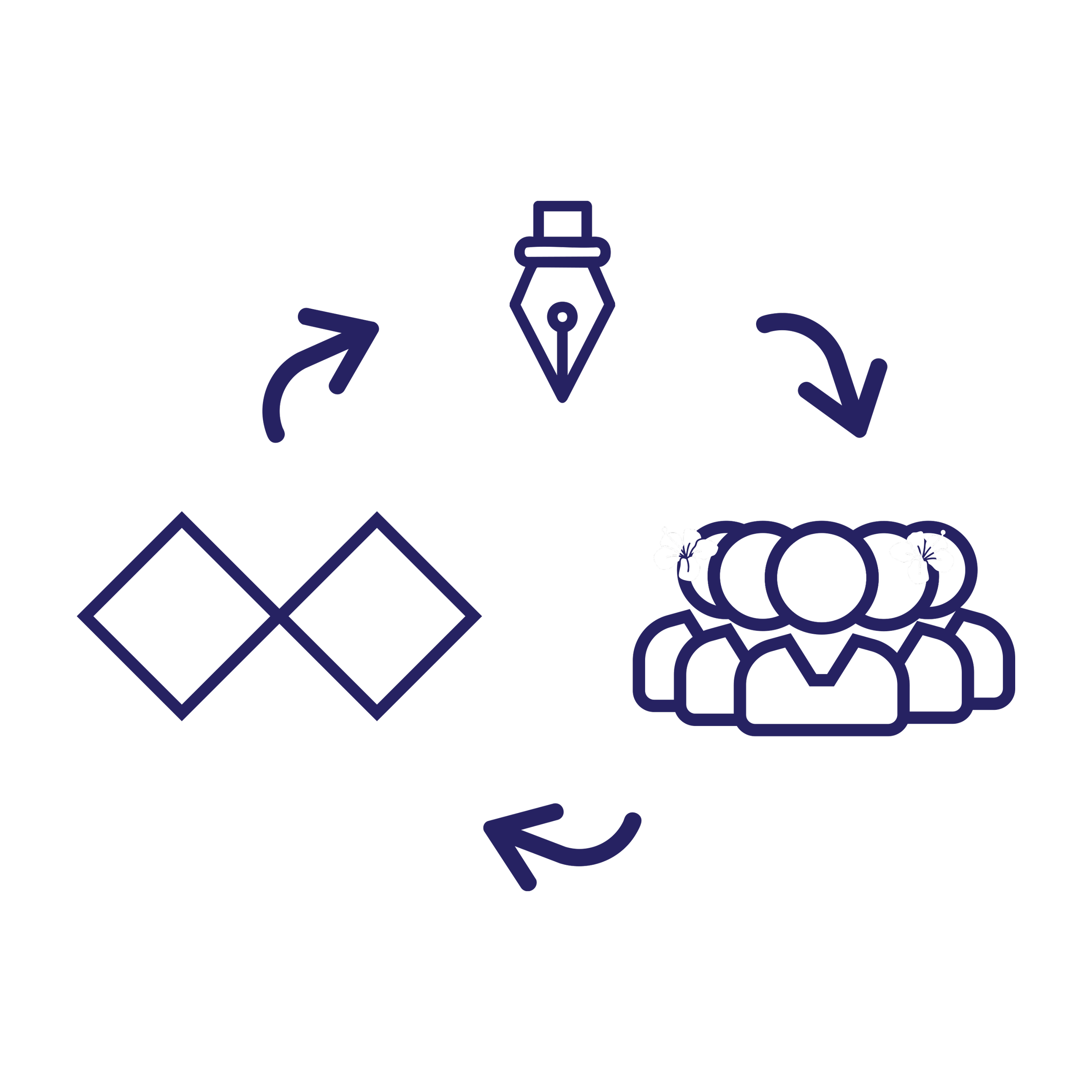
This project brings together:
Visual communication design oriented towards visual identity and infographic design.
Pacific research methods - specifically, Talanoa.
A re-working of the Double Diamond design framework.
Together, these aim to shape a community-engaged design response for better engagement with Pacific communities, resulting in enhanced understanding around emergency preparedness.
The research is undertaken through Toi Rauwhārangi College of Creative Arts, with engagement with the Joint Centre for Disaster Research, Massey University Te Kunenga ki Pūrehuroa.
Nofo Sauni
Project Exploration
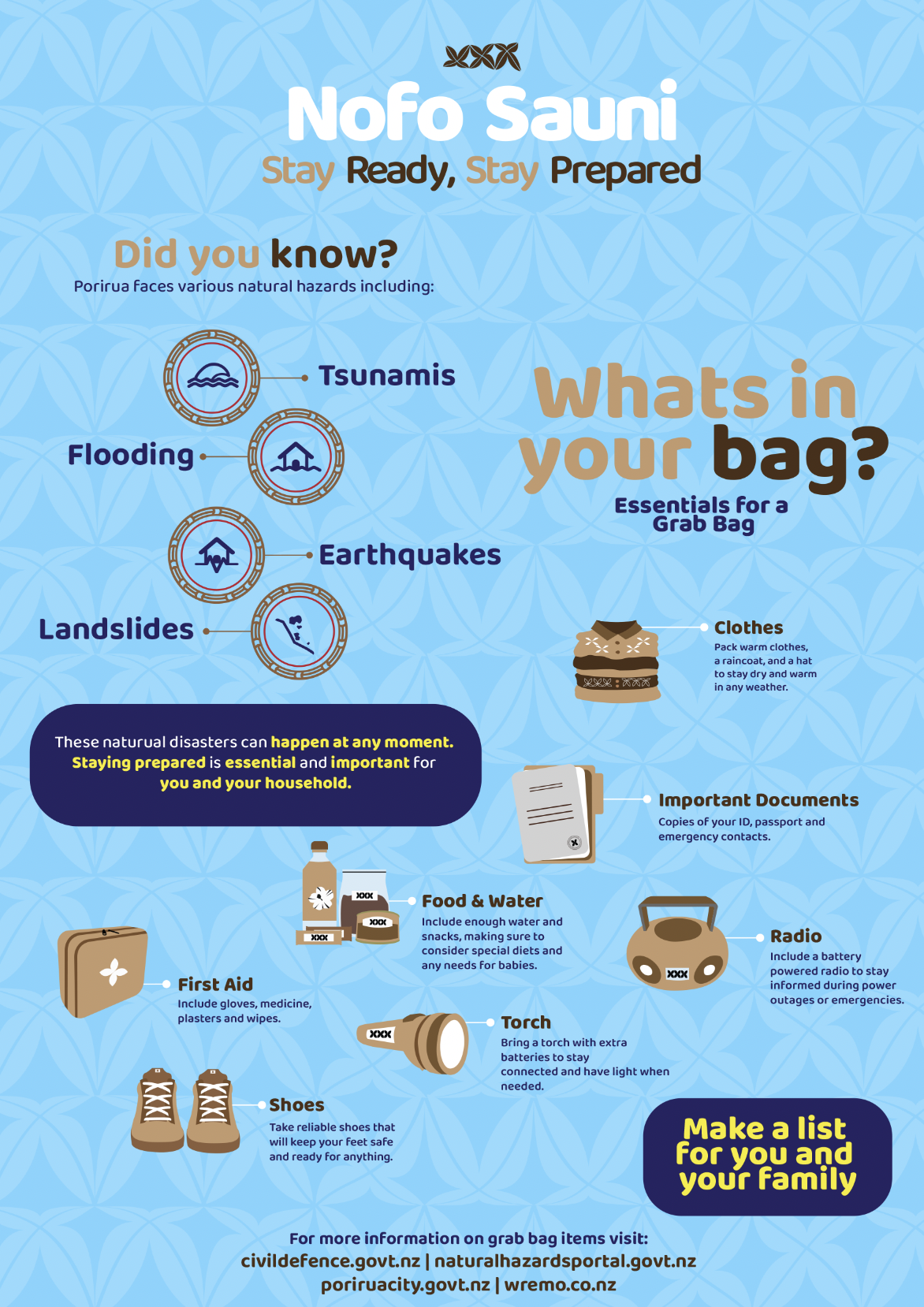
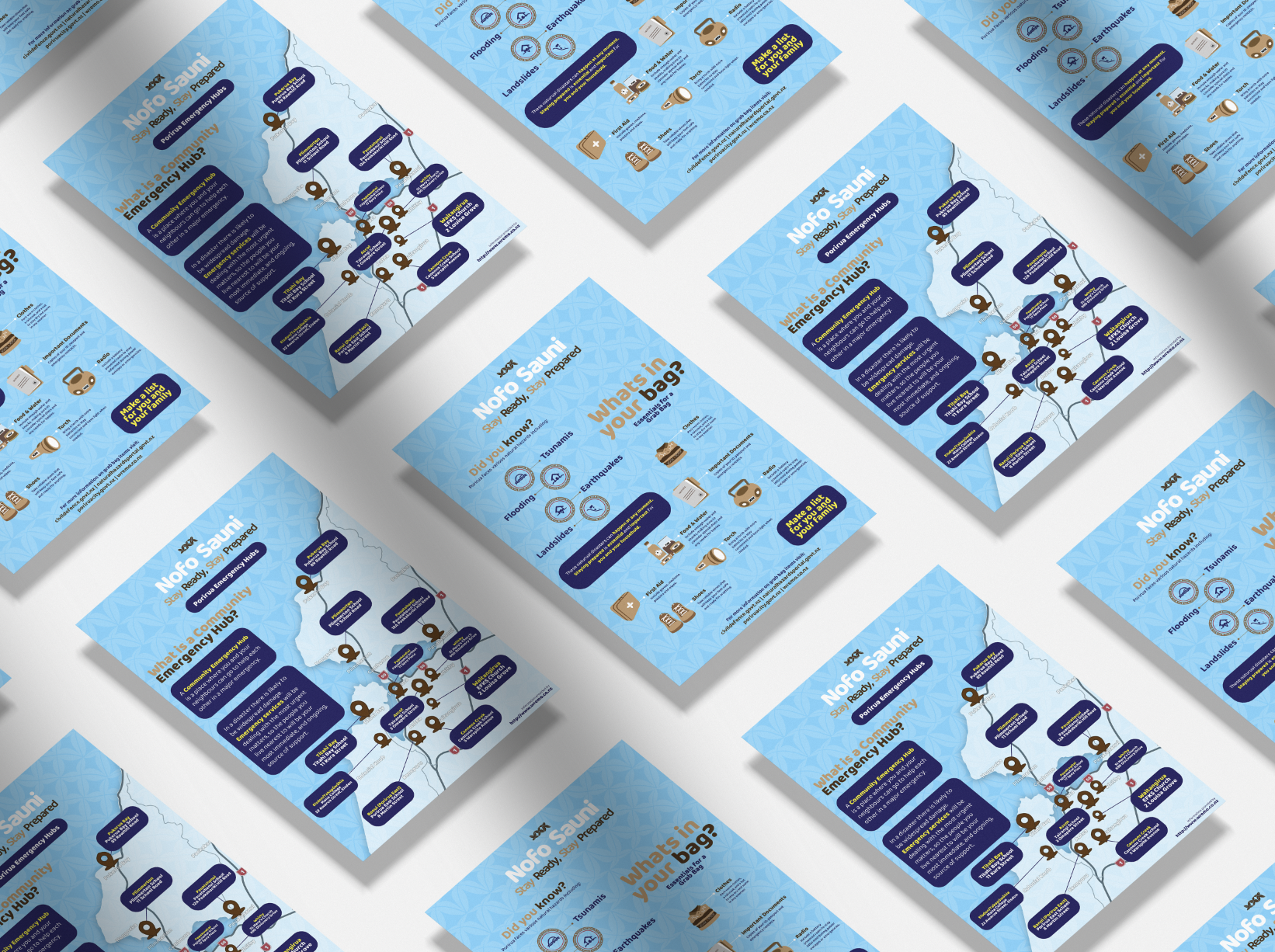
This design project focuses on messaging relating to emergency preparedness. It looks into how information on grab bags specifically essential items you would need incase of an emergency, can be visualised, presented and shared.
I am developing and using visual communication design to create Pacific inspired icons and outputs with the hopes of increased engagement and understanding within Pacific communities.
Within my initial research, there was very little design within Aotearoa-based emergency management reflecting Pacific cultures, identities and imagery. I wondered through changing the visual language, could design improve engagement and stimulate increased awareness and preparedness within Pacific communities?
Methodologies
Talanoa
Talanoa is a Pacific method of open conversation. It’s involves storytelling, sharing experiences, and building understanding.
Vaioleti, T. M. (2006). Talanoa research methodology: A developing position on Pacific research. Waikato Journal of Education, 12, 21–34.
Using Talanoa in this Project:
I started by using Talanoa to talk with an extended Pacific Island family in Porirua, Wellington (who whakapapa to Samoa and Tokelau) . This process helped me learn deeply about their lives, values and challenges, and enabled me to share my aspirations for the research.
Adapting Along the Way:
As the project evolved, things changed, and unforeseen life -events unfolded. The research needed to respond to these changes. The Talanoa method helped to navigate this through open and fluid exchanges, which acknowledged complexities and contradictions.
I had to:
Pivot and adjust the process to respond to environmental factors and the preferences and availability of the Talanoa group.
While centring the feedback from the Talanoa group, I also sought feedback from other sources, including emergency management and design specialists.
Develop the designs to reflect the views and feedback from the Talanoa participants as well as from wider community engagement.
Design Identity
The design identity is the visual voice of the project. It contains core features including its colour palette, typography (the letter forms), illustration decisions (including the design of symbols/infographics) that seek to represent both community and culture. The design choices stems from academic research, community engagement, and personal lived-experience, and it aims to create a visual presence for Pacific people to recognise and connect with. It intends to be more than a decorative visual element, and to open up a space for storytelling, conveying meaning and fostering a sense of belonging.
Disaster Design Icons
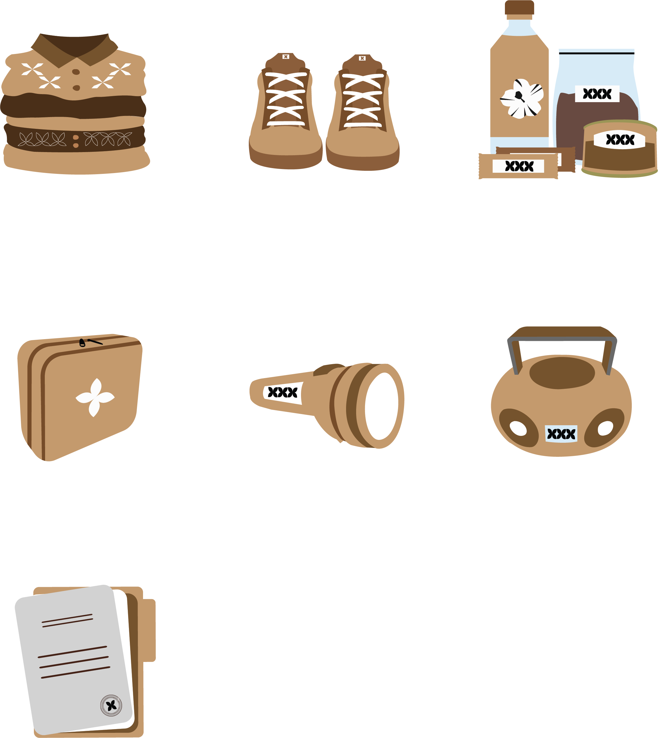
The icons are designed in a vector illustration style that seek to represent both culture and community. The icons aim to reflect shared experiences, values, and connections to Pacific culture. The use of vector illustration allows for clarity ensuring the icons remain recognisable and cohesive across different platforms while reinforcing a strong sense of identity and belonging. The chosen icons are selected based on talanoa feedback and analysis of existing emergency management content around grab bags.
Final Design Mock Ups
This project explores the question:
“How can visual communication design be used to improve Pacific engagement in emergency management in Aotearoa? ”
Over the last decade, I’ve grown as a Pacific designer and researcher physically, mentally and spiritually. Nofo Sauni brings together learnings from those years, shaped through my design practice and evolving ways of thinking.
The research focus is based in Porirua, Wellington, guided by the idea of:
“By Pacific, For Pacific”
It reflects my positionality as a designer born and raised in Porirua, and my intention to serve my community, through helping to enable and support Pacific communities to lead with confidence and strengthen for the future.
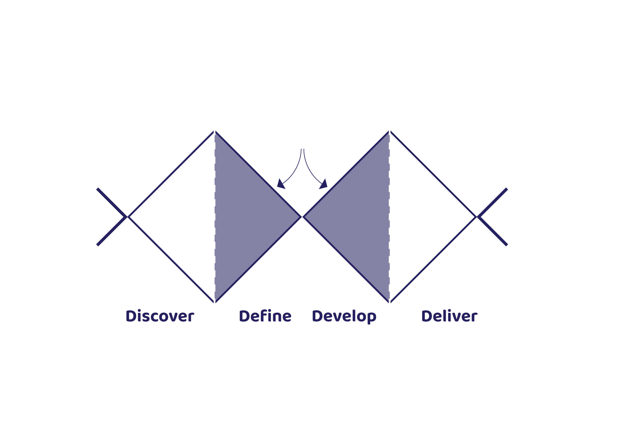
Double Diamond
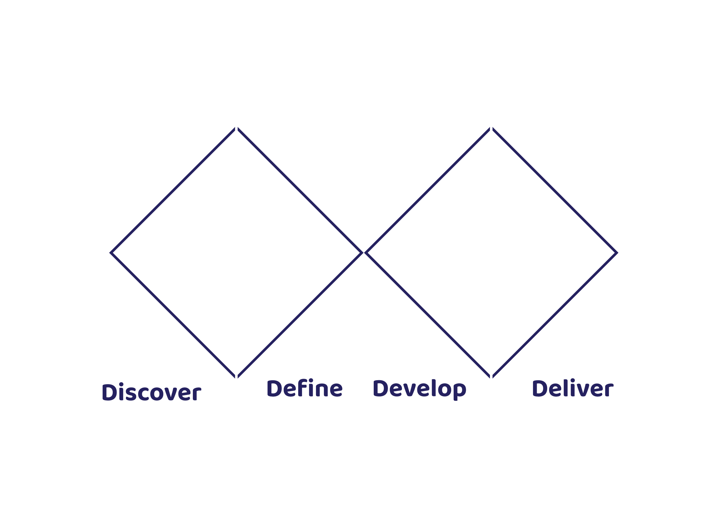
The Double Diamond is a design method commonly used within Eurocentric and North American design process. It is an adaptable model with four main stages:
Design Council. (2005). The Double Diamond: A Universally Accepted Definition of the Design Process. Design Council.
Discover - Develop - Define - Deliver
It helps with identifying a ‘problem’ that design can address, and create possible solutions through iteratively exploring many ideas, then selecting and refining those that are thought to be most effective and successful. The process understands that the first solution or idea might not be the best one, and that the process can be repeated to arrive at the most appropriate design ’solution’.
Hacking the Double Diamond
In this project, the Double Diamond was customised to:
Include a guiding sense of purpose, and positionally.
Add more reflection and feedback between each phase.
Include extra steps after delivery to plan for the future.
Make the process more flexible and responsive.
The font used in this project is drawn from a case study explored within this research. It was chosen for its strong, clear and engaging appearance, making it effective for communicating important information in a way that is easy to read and visually appealing.
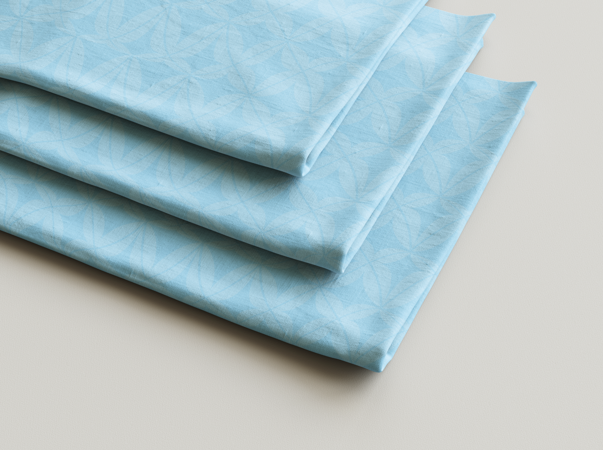
The flower design brings together two key themes: Natural disasters and Pacific people. This connection is symbolised by a well-known Pacific motif, the frangapani flower. The frangapani flower has strong connection to the history of polynesia specificlly within the decoration of the barkcloth. A warp effect is applied to the flower to suggest natural disturbance, reflecting the sense of unease and disruption that comes with natural disaster.
The colours chosen intend to reflect elements prominent within Pacific cultures; the ocean, the sun, and the natural environment. The palette also draws from the colours used by Civil Defence, drawing on languages of urgency and alert, which in turn links the design to official emergency services.
Circular Natural Disaster Design
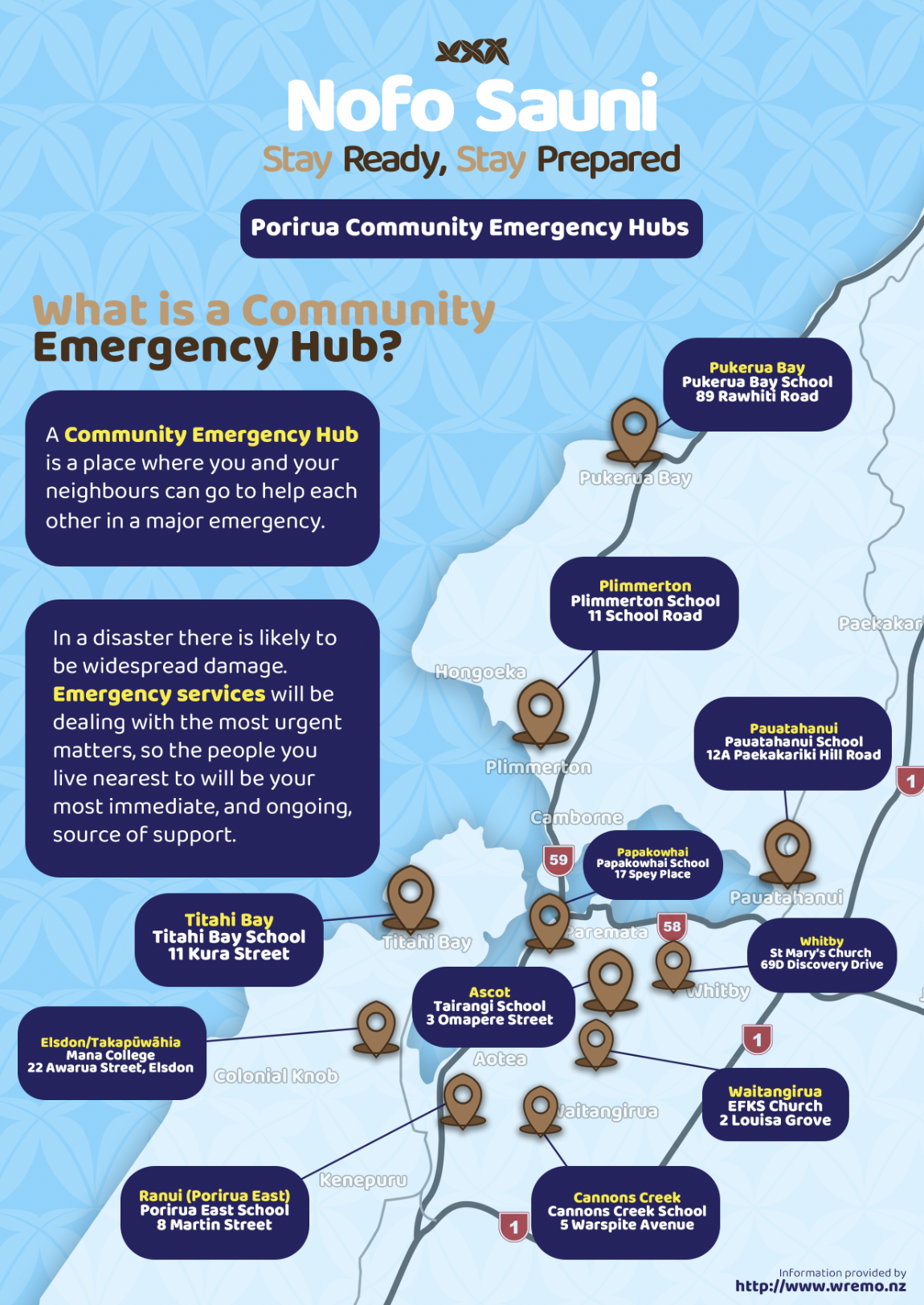
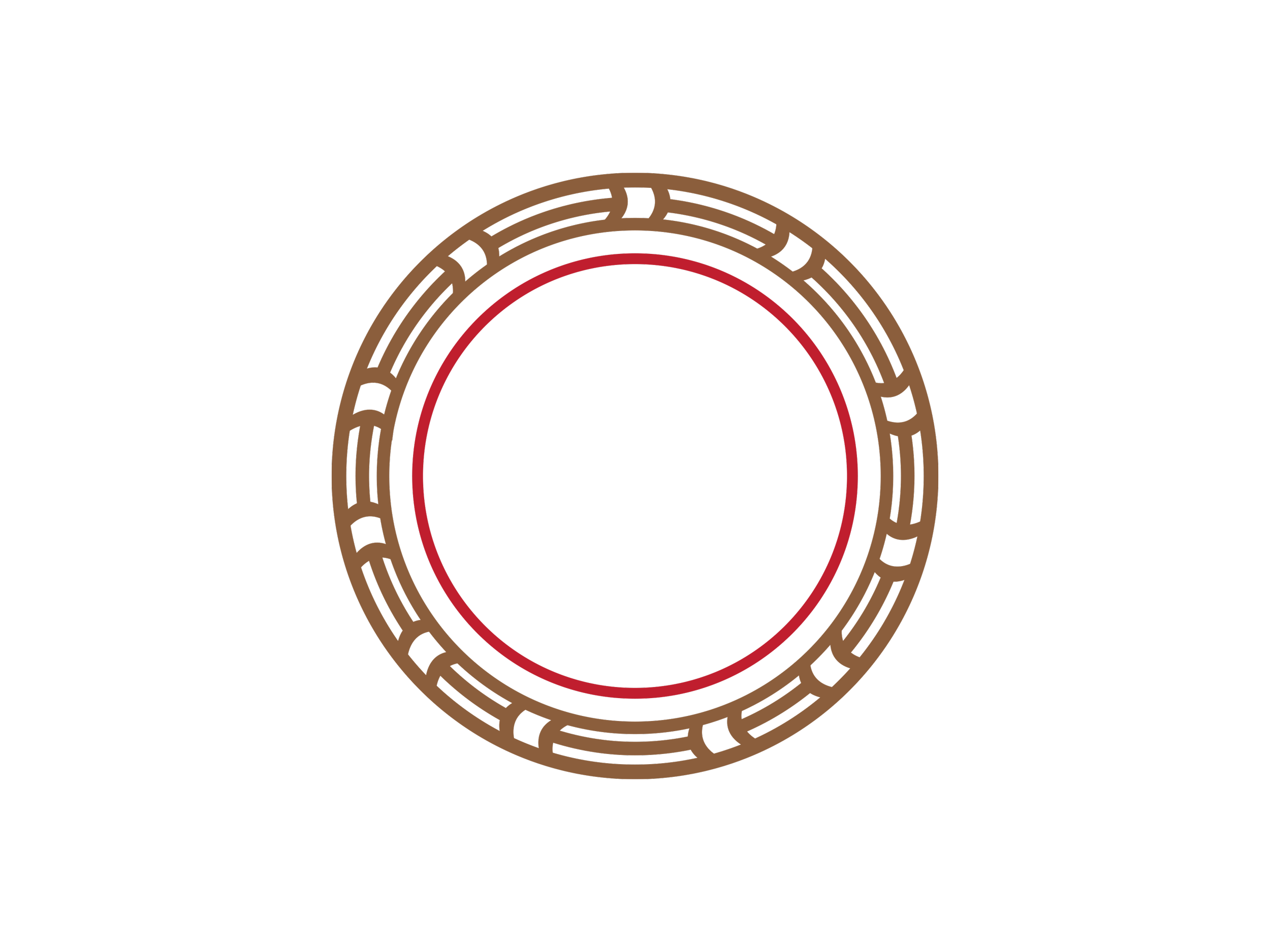
The thin red line represents the hazard and danger surrounding the disaster showcased in Infographic Poster 1. The brown outer design contains 11 adapted squares representing the 11 emergency hubs in the Porirua region with lines in between to represent connectedness and community.
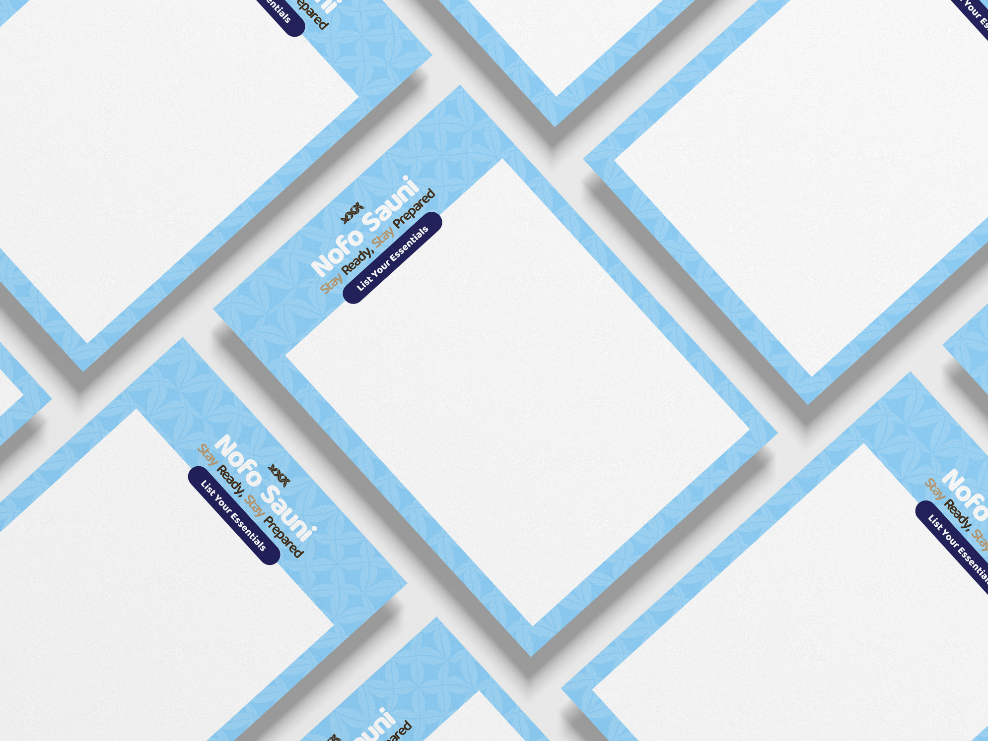
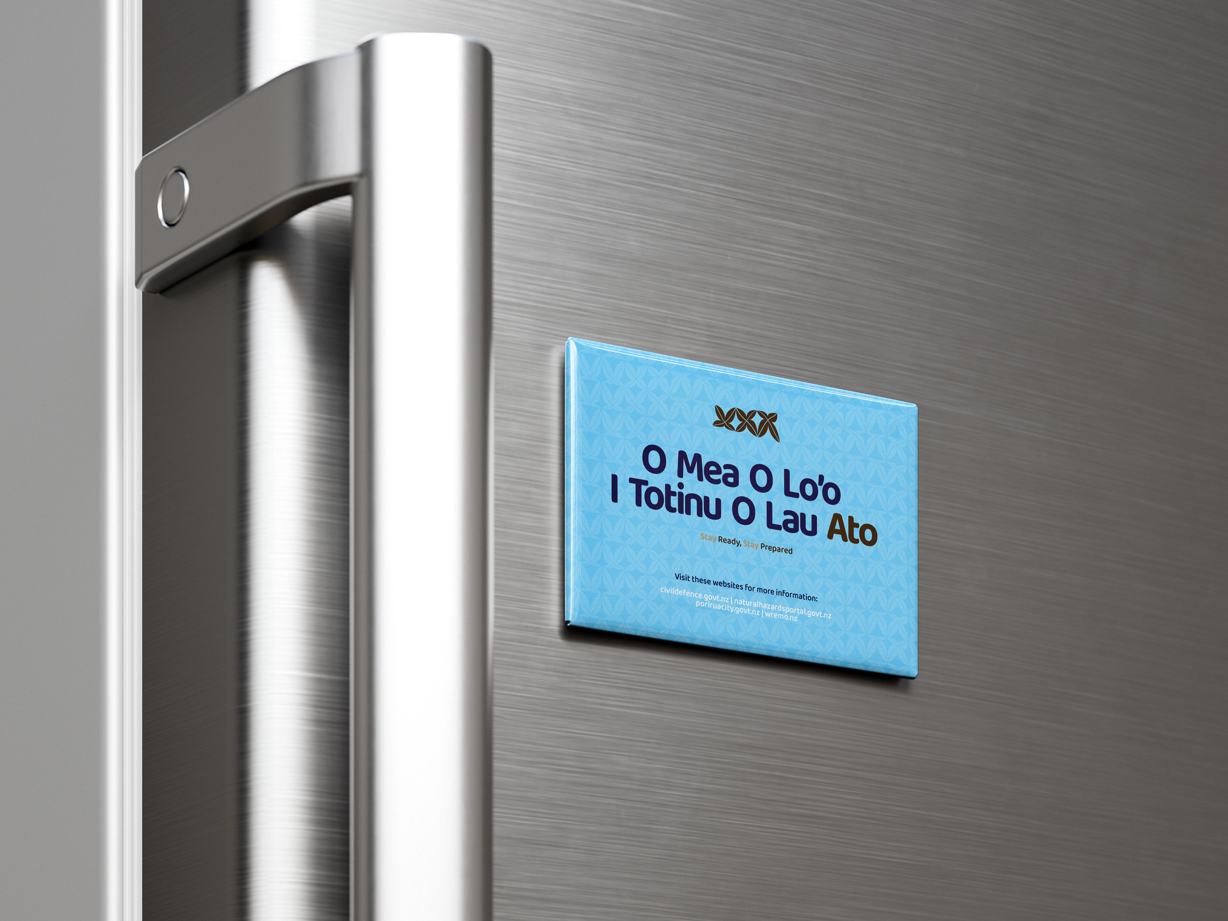
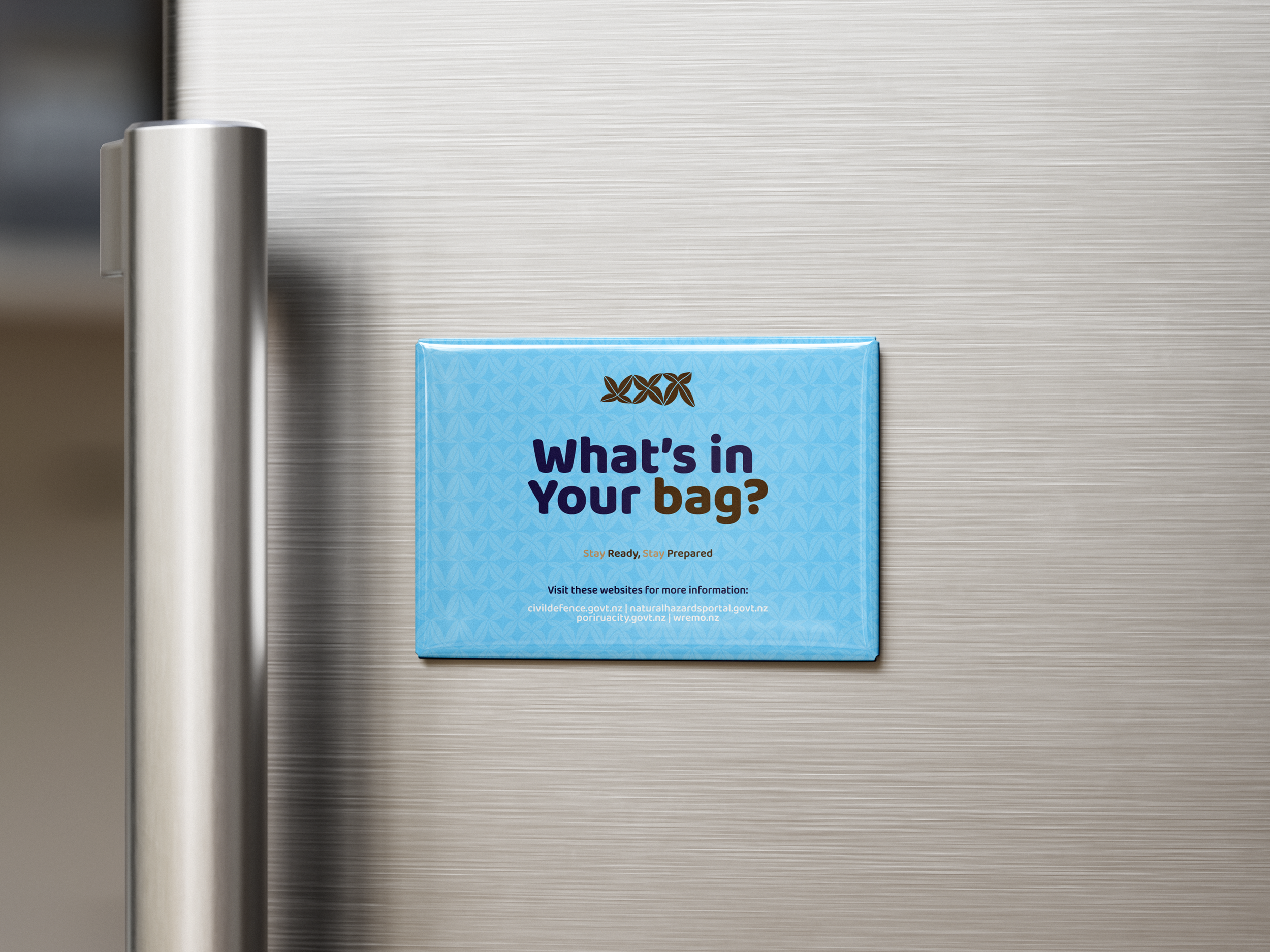
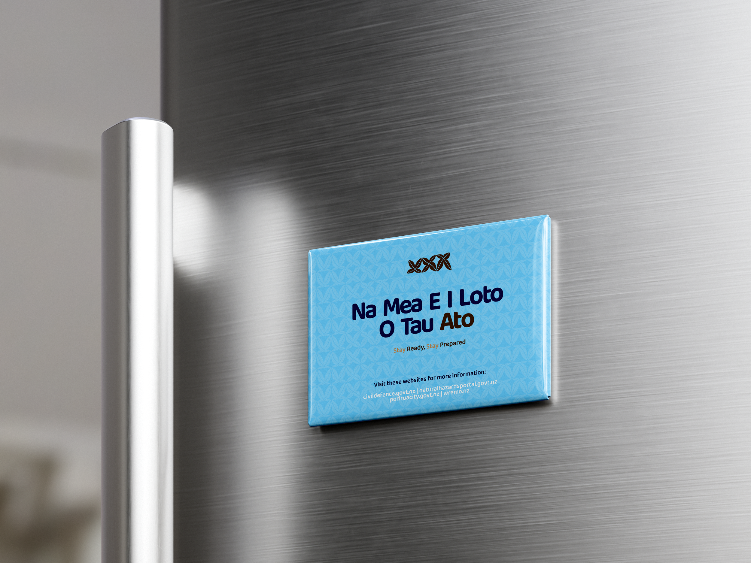
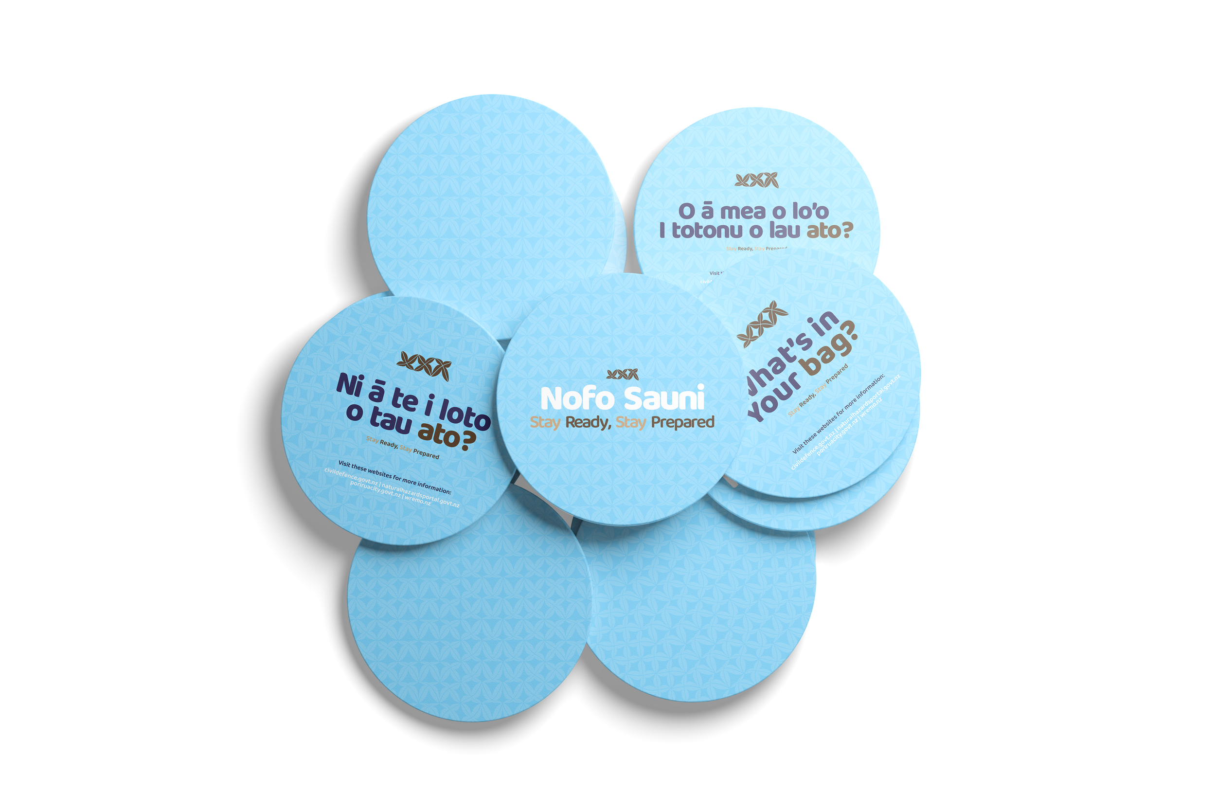
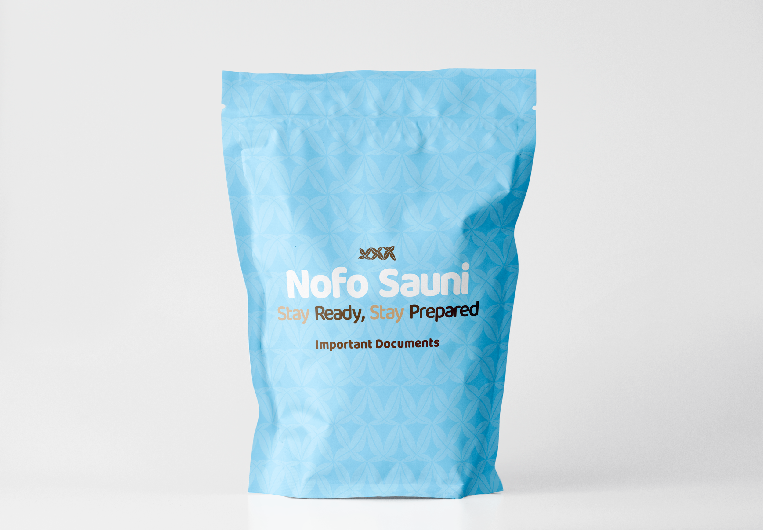
The design work showcased below are the final design iterations created for this project.
The designs are applied to household objects, with the intention of highlighting the importance of preparedness in daily life.